Judge a Pokémon: The Smog's 6th Art Panel
| « Previous Article | Home | Next Article » |
Introduction
Hi, folks, I would like to welcome you all to another round of JAP! This time we are taking a stroll down memory lane, and rating some designs everyone is familiar with, even your sell-out "cool" friends who now reminisce about how fun Pokémon was when they actually played. Pokémon may be a true monster franchise today, but it was the terrific designs (and not the horrible naming sense) of Red-Blue-Yellow (Red-Green-Pikachu in Japan) that set the stage for the Poké-phenomenon. Today we bring you rates on 8 of these classic Pokémon. We also have another guest judge in everyone's favorite Smeargle mod, Nastyjungle (sorry, Alch, Nasty is cuter)! Please enjoy!
So since we'd done a fair few Generation 5 designs and we knew this issue was going to be a little different with old panelists absent and new panelists present, I deliberately asked Chou if we could review some older mons. I mean let's face it: the older mons have some of the most iconic designs and are largely responsible for how popular Pokémon is today. Haha, that saiiid, the list I chimed in with contains some pretty obscure mons. If you take issue with any of these choices, look no further!
Reference: Kinneas is represented by Spoink, Swaggersaurus is represented by Dragonair, Chou Toshio is represented by Tyranitar, Alchemator is represented by Elgyem, and Nastyjungle is represented by Venusaur.
—Swaggersaurus
1. Graveler
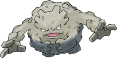

Graveler is easily the coolest of Geodude's evolutionary line—except what the hell is up with that line anyways? Geodude to Graveler makes sense: it gets some legs, another pair of arms, and a bigger body, standard Pokémon stuff. What happened to get to Golem? It randomly loses the arms it gained before, the rocks it's made of change dramatically, and it grows reptilian features...? I can't say I really understand it at all. Graveler sure is smug-looking, probably because it knows it's going to Selfdestruct as soon as you're about to KO it. I can see why az likes this mon so much; it is pretty charming, but I just cannot stand to leave a mon unevolved—guess it's forever Golem for me.

Graveler was a mon I insisted we look at. I have to apologise to the denizens of #pokemon; I spend a great deal of my time in that channel polling them for their opinions on cute, cool, and underrated mons, and imo Graveler is all three, especially the last. The big gravely mass for a body is a huge step up, I think, from the more popular Geodude, and I've always been really disappointed with Golem. I also love how he has four arms—you can just envision him bounding gorilla-style up, down, across mountains like he just dgaf. His shiny looks great too (I bet you have to look it up!), and he even has an awesome alternate name thanks to the French version, Gravalanch. Also, he is a middle stage evolution, which makes him really indie and cool!! x) Man, I love this mon.

I remember seeing the Geodude evo line before I played the games and thinking it went Geodude < Golem < Graveler. Who's ever heard of an evo line evolving and then devolving a pair of arms? I don't get it. I don't want to spend a paragraph comparing Graveler to Golem though, as Graveler is a great Pokémon on its own. I really love Graveler's animated expression, I think it's more cheeky than smug, although I can understand Nastyjungle's comments about self-destructing. I think Graveler's role as an in-game exploder has given it a bit of a bad press; he's a cheerful guy really. He's not out to ruin your day or OHKO your Ivysaur. He's like the guy at the house party who goes a bit too far and ends up filling your parents' fish tank with rum and tiny cocktail umberellas. "Sorry, guys, blowing up during your dungeon run sounded like it would be funny at the time." Graveler likes to party hard.

As Bulbapedia riskily says: "It appears that Graveler is a living boulder." I think this design harks back to a time, absent of monstrosities like Dialga and such, when designs were basic but still excellent. Indeed, Graveler may even be one of the best mid-stages in the entire franchise! Most commonly featuring a wicked smile on its face, Graveler certainly has an attitude that could carry any design (perhaps, even, a plain old rock! No, wait, that's silly...), and it is this attitude that is sadly lacking in both its pre-evolution and its latter form, Golem. Oh, and it has four arms; excessive limbs makes pretty much any design great.

As with most mid-evolutions, it can be easy to lose in the shuffle. Rating Graveler had completely escaped my mind until Az and Nasty pushed for it. I'm glad they did though, as Graveler is an awesome design really unique from every other "moving rock" Pokémon. At first it looks like just another round rock sitting between Geodude and Golem, but frankly our middle man has a lot more awesome than either of its related designs. What makes Graveler unique is that it sports a 6 limb count, with feet, short hands, and long arms; it's something really different from the simple roly-poly Golem. The short tiny hands-with-no-arms are easy to miss, and frankly they're so hard to see in the RBY sprites that I didn't even know they were there, and it wasn't until later illustrations of Graveler that I came to notice this fascinating balance of grip, climb, and stand. After all, with basically no arm at all on its front limbs and no legs at all for its feet, I doubt Graveler's shorter appendages are good for anything but holding stuff and standing, respectively. Maybe that's all they need to do with those monkey-arms launching it from cliff to cliff, something truly cool to imagine.
2. Clefable

I'm sure that Nastyjungle is going to totally fangirl over this design, so I think I'll be extra cut-throat in my review so that you, poor readers, might have a more mixed JAP experience. I've never quite understood Clefable—if I'm honest, I've really only ever seen it as a terrible version of Wigglytuff. I suppose it also doesn't help that it was pictured with quite the grimace in its DP sprite, which must have formed a lasting impression on me. If I'm honest, this just seems like a strange pink pixie: one of the Pokémon in generation 1 without a real origin or purpose.
Yes, yes, YES. Clefable is one of the baddest mons out there, gen one or otherwise. Imagine it donning a pair of blackglasses and stomping in the face of an Articuno or something. That is my fantasy attitude of Clefable—purely badass. If I'm not allowed to make things up, then Clefable is kind of gay and sissy-looking, yeah. I definitely did not like it as a kid. Probably what started my love of it is how much fun it is to draw, I could probably draw Clefables all day and never get bored of what I was doing. So I slapped on a grizzly personality and never looked back. As an aside, Cosmic Power, Softboiled, and Toxic combined with Clefable's Magic Guard can make for some excellent shenanigans, and it is so pleasing to see the opponent completely unable to do anything against your fat, pink wall.
Haha, so after getting my own fill I had to represent; I knew nj would be joining us this issue, and if you know nj (or follow her amazing nuzlocke) you'll know that she absolutely loves Clefable. As a kid I think I completely overlooked Clefable. First of all it is pink, which didn't help, and to own a Clefable you needed to have Clefairy, which is arguably one of the most girly mons out there. That said, looking back Clefable has a lot of charm. I love its fat spiral tail and the stylised wings on its back that really give you the impression that it has come a long way from its days as a Clefairy. I think nj has really taught me to love this mon! I certainly cannot envision it without thinking of her more badass, smarmy depictions of it.
To be honest, I'm still not quite sure why everyone wanted to review this. To me, it seems like one of the least inspired designs of the generation, and certainly is the most drab Clefairy evo GF could possibly have designed. I mean, it's basically a taller Clefairy with longer wings and ears; it even lost Clefairy's adorable fang. Seeing as Cleffa is also just a smaller simplified Clefairy though, I get "drab" is what GF was going for here, and the drabness of the designs makes me want to just spam a DPP strategy and use Cleffa Level 1, Clefairy Level 2, Clefable Level 2 for Hail/Endeavor SPAM antics, a strategy in which, like their designs, they might as all be the same Pokémon. I don't know, Wigglytuff was cooler :(
Clefable has some neat tricks in its movepool and abilities, but judging it purely aesthetically, it has nothing going for it. It's probably the best of the original four pink fairy things simply because it has a few more pointy bits than the depressingly blobular Wigglytuff. It's still just a pink fairy thing though. Are those popular in Japan? Are they Kirby parodies or something? I don't know. Clefable kind of reminds me of that one fat special needs kid with the socially awkward stance and whose limbs look too short for his giant body. Not a good look.
3. Cloyster

Why on earth was this guy not a bigger deal to me back in Red and Blue? I think the answer is actually a testament to its design, not a detraction. Looking up its Red and Blue sprite, it looks positively intimidating. The face looms ominously beneath its shell (which is at least twice as big as in the Sugimori art, which helps) and its spikes jut out dangerously at wild angles. Cloyster was probably a Pokémon I just learned to think of as an enemy; I dreaded to face it so much that possessing one was out of the question. This is a testament to its menacing design, and a real turnaround from the much more whimsical Shellder that it evolves from. As an aside, I love that mon too!
Woah, Jesus, Cloyster is scary as hell—but scary in all the right kind of ways. The contrast between its simple "main" body compared to its outer shell is a really fantastic design choice and whoever made it should be patted on the back. I can't say much about it outside of that; it's always just been a mon that's kind of just...there for me. I mean, I'm never going to use one in-game or anything. It's a good looking thing, I won't deny; yet it remains vastly inferior to its glorious counterpart Starmie in almost every single way, real talk.
Cloyster is great. For anyone who has played older gens competitively, Cloyster is one of those Pokémon that you will always want to fit into your newer gen teams because you remember how godly it was at one point. There's something menacing about the way the spikes seem to jut out in random directions, and that confident grin that's saying "come at me bro." Cloyster looks tough. Cloyster was tough. In fact there was a time when Cloyster had the proud title of highest Defense stat in the game, and as one of the few Pokémon who could safely switch into an RBY Tauros, he deserves recognition as one of the most badass Pokémon of all.
Ok, I need to stay away from these terrible connotations which are currently penetrating my mind, and throw myself wholeheartedly into this task of analysis. Sexual references aside, I do think that Game Freak has not yet reproduced such an inventive design in four subsequent generations. Its biggest allure for me is how interesting it can be with so few colours: it only uses shades of purple and gray, yet you could never say that this design is bland and uninteresting. In some ways I think Game Freak has retreated into its shell as the games have progressed, as now they seem to rely on bright colours and unnecessary design features to mask inherent flaws in their concepts.
Overall, this design is... brilliantly conceived.
Ok, I need to stay away from these terrible connotations which I am currently penetrating with my mind, and throw myself wholeheartedly into this task of analysis. Cloyster is a Pokémon that inspires a man's romance. Who would not be captivated by the shape of those curvacious outer lips, modestly framing the soft, silky folds of the inner cavity of this beautiful oyster, contrasted by the blunt and excited horn raised above the opening of the cavity... yeah, you can totally see why Cloyster's design was... censored? reworked?... in the RBY sprites for the English games. Looks like localization gave up sometime after that and I'm glad they did. Man, I love Cloyster.
Overall, this design is... brilliant for conceiving. Wait.
4. Tangela

Tangela looked much bigger in its Red/Blue sprite; I'm glad since then it's been represented as much smaller and cuter in most of its sprites because, honestly, when I first saw it in my Pokémon Red game I thought it was a homeless person—it's even got the boots. I think Tangela is one of those designs that just works, and it's hard to tell why. It constantly looks nervous as if it's expecting a hedge trimmer around every corner, and I imagine it would try to run away from everyone and trip over its own vines. Cute.
I think it's a shame it took until the fourth generation for Tangela to get an evolution. Actually, maybe the shame is that it got an evolution; I'm not a fan of Tangrowth at all, and leaving it as a single stage mon allows it to remain in the tier of elite single stage mons like Farfetch'd and Tropius (although actually the thought of a babby Tropius pre-evo with little fruits on its head is too much to resist). Tangela itself is a breed of weird and cutesy that I think got hammered out of Pokémon's style as the games progressed. Take, for instance, Tangela's little red boots for feet. Its design is brilliantly simple—two eyes, a ton of vines and two cartoon feet, coloured to stand out from the main body. It is crazy to think that the inspiration for Tangela is Medusa, a monster so foul to behold that all who did so instantly turned to stone. I mean, just look at his cute little face!
You know, I think I could really get to like Tangela with a few small changes. First of all, it would have to lose those really weird boots, which seem so incongruous with the rest of the design. Secondly, it needs an increase in size and an alteration in proportion—the eyes are far too central, and somewhat unnerving. Finally, it should probably get some longer vines to serve as arms. Oh wait, that's Tangrowth. Really, I can only commend Game Freak for deciding to give this ghastly thing an evolution, since this is such a peculiar design. I dislike it for the same reason as I dislike Forretress: some kind of 'shell' with eyes peeking out is not my idea of a good design. Apart from Cloyster, of course!
Tangela... there are so many things you could say about this design. I could say, "This design is so boring, it's a bush with feet." Or, I could say, "Erica: Oh, yay! Tentacles!" O.o What I will say is that Tangela is a truly quirky blend of creepy and cute, and somehow manages to come across well despite just being a bush with feet. I definitely like the redesign post-RB, with GF making it rounder, cuter, and more charming that the massive wad it was in its original sprites. It kind of reminds me of the dust bunnies (makkuro-kurosuke) from Totoro. Yeah, it does kind of look like something Ghibli Studio would design.
Tangela is a super cutie, and everybody else can go shove it. It's got like, little red boots for feet. Really cute. When I was a kid I even had this little Tangela top thing that you revved up on the floor and then it would spin around. It was one of my favorite toys and I know that some people reading this remember that thing. It was so fucking cool, you know it was. Actually, that is probably the only reason I'm defending Tangela at all. Honestly, this thing is most likely just awful and my eye is clouded when I think about that really cool Pokémon top I used to have.
5. Starmie

BUBBLEBEAM!!!!!!! KER-BLAH-KER-BLAH-KER-BLAAAHHH!!!!! (you die). RBY Misty had to be the single most stupidly broken (stupidly awesome?) Gym battle in the history of the game. That battle was just curb-stomping bad-ass in so many ways, and it wasn't just that your pitifully unevolved team of misfits with no attacks with Base Power higher than 50 was facing down 100 Special, 115 Speed (with RBY critical hit mechanics), fantastic overall bulk and a 65 Base Power STAB Water attack, it was also the design. Starmie's RBY sprite just looked so damn intimidating! Its sleek, dark, sharp points and ominously glinting gem made it look simply sinister (at least after the first time it kicked your ass). Simple but sinister. Amongst my friends, it was nicknamed the "Death Star" for looking like (and being) a total bad ass. BubbleBeam's RBY animation was also frickin' insane; you were just shittin' your pants as the Death Star blasted the crap out of your pathetic pokes. The fact that Starmie still manages to come off as cool, mysterious, and beautiful on top of being intimidating is just a testament to this excellent design.
Let's be honest: any attempt to analyze Starmie's design purely based on aesthetics is not going to work, because since the second gym battle of every serious trainer's life, Starmie has been branded into childhood memories with a mixture of feelings ranging from "I HAVE TO GET ONE OF THOSE RIGHT NOW" to "I never want to see that thing again so long as I live." Starmie is unique in this game, as it's probably one of the few Pokémon, along with maybe Gengar and Snorlax, whose presence is eternal. No generation has been safe from Starmie's influence in the OU metagame. But Starmie is also one of the few Pokémon that has also managed to establish its character within the anime. "HIYAH!" All of these things combined make Starmie one of the most memorable and best Pokémon of all time, even if it is just a pretty starfish.
HWA! Ok, I guess that was Staryu, but still. I've always loved Starmie, both because of its strong and beautiful appearance in the anime and its imagery-filled Pokédex entries. "STARMIE's center section—the core—glows brightly in seven colors. Because of its luminous nature, this POKéMON has been given the nickname 'the gem of the sea.'" It's such a romantic scene to imagine that Starmie are littered across a sunset-infused beach as the waves lap against the rock pools and Wingull glide on the horizon. I don't know, I guess I'm just a sucker for that kind of stuff.
What a pure, unadulterated beast Starmie is. First of all: HYAAAA. We know this thing means business when it comes into battle because it's already doing like battle cries and shit. Then, you notice that big ol' ruby square in the middle of its chest. Obviously this thing is high class as shit because its got a precious stone the size of a minivan jutting out of its own body. Surely there's nothing more this mon has up its sleeves. Wrong—it busts out BoltBeam on the poor, soon-to-be-dead opposing mon. Man, Starmie is really just killer. I really like that it doesn't just lay flat and stiff; it can like, get up a walk. I've always found that to be the best image; there isn't anywhere to run because it can just strut out of the ocean like a true G would.
Staryu and Starmie both are great designs. They are simple—just stars with gems, in the middle, really!—but the colour palettes are just right for starfish, and I love the weird extra-terrestrial lore that is added to them both game by game through Pokédex entries. If you haven't already, run through them all from Red and Blue all the way up to Black and White. Eerie stuff! Back to Starmie's design, though, I'll admit there isn't much more to say, but again I don't think this is a problem. It's a starfish, or seastar. As a result, it's shaped like a star. How much more simple can it get? Now if only Starmie could get decent shiny colours, I think we'd be alright.
6. Gyarados

I absolutely adore the concept of Gyarados—the useless fish gaining power and wreaking havoc and righteous anger against, well, everything. In terms of its actual design, however, I think it has a few flaws. In contrast to the aforementioned designs of Graveler and Cloyster, Gyarados' design is actually quite busy, with no real focus. The closest thing to a focal point is its mouth, which is constantly kept open. While it is described as "the Atrocious Pokémon" it maybe shouldn't have tried so hard to fill that species name. The concept, however, does carry Gyarados to victory, in my opinion.
Gyarados was all the rage at school when I was a kid. Also, no one could pronounce its name. I think this is one of Chou's picks, but I'm glad we're covering it. Looking at its Red and Blue sprites is a great nostalgia kick. Without fail, Gyarados manages to look intimidating. Even in his worst sprites, the ugly Ruby and Sapphire ones, I don't think I'd chance it. The various frills, fins, crests, and barbel (check out my fish terminology) all dress it up nicely as a sea serpent, and look great flowing backwards as it winds toward its target, as it is depicted in most of its sprites. They also help us to identify Gyarados as a sea serpent and not just some dreadful mega snake from hell, which helps, because honestly you could be forgiven for the mistake. Carrying many of these features over from Magikarp is a nice touch, because I think Gyarados's identity as a badass that has evolved from something typically seen as useless is an important part of this mon. It's a huge transformation that players seeing it for the first time would have never expected, and served very well to establish some of the mythology and magic of the Pokémon evolution phenomenon. It still hasn't learned to keep its mouth shut, though.
I'll come right out of the gate with my unpopular opinion: I don't like Gyarados. This is another opinion that probably stems from trying to draw it. What a dirty little piece of crap this thing is to draw. I'll give it props for somehow simultaneously managing to be busy as hell and yet, at the core, rather simple. Really it's just a pretty boring design, in my opinion, and I'm tired of seeing it. Due to Magikarp being in all gens bar 5, I always find myself saying "Oh look, it's Gyarados again" with a sour taste in my mouth. To be honest I'm also probably sore about it not being able to make use of the most helpful half of its stab until Gen 4, but I digress.
Gyarados is another Pokémon like Starmie that defined itself by its appearance in the anime. The first episode I ever watched was the one where Gyarados goes mental after the SS Anne sinks. See, Gyarados will always be cool because it reminds us of a brilliant time in children's television where violence was okay if it had meaning and served a purpose in the progression of the narrative and Pokémon tried to fucking KILL people. That doesn't really happen any more. In fact every post-DP episode I've ever watched has revolved around Dawn getting her Pokémon to do a pirouette in a contest and then either winning or losing the contest, but that part doesn't even matter because she LOVES them. I haven't seen Gyarados in recent episodes and honestly I don't want to. Gyarados should be a Pokémon that is filled with hate and doesn't give a fuck who it hurts because it earned the right to be that asshole when it was a little Magikarp who was bullied all the way through Pokémon high school. I love you, Gyarados, because you hate.
Ah, Gyarados, another bad ass Water-type (and my personal favorite Pokémon!). Every single rendition of Gyarados has just been simply awesome, and I don't think any generation of Pokémon playing kids have not felt the robust romance of this elegant but totally bad ass looking Pokémon. It's a Chinese Dragon, how could it not be more awesome? The design's connection to the ancient Asian legend of strong carp transforming into mighty dragons makes the design even more fascinating, and Gyarados's subtly fish-like features, reminiscent of Magikarp, add even more flavor to this blend of vicious and graceful. The Red Gyarados was also a fantastic addition to Gyarados's overall design, with the bright red and gold coloring connecting it even more strongly to the Chinese aesthetic. Red Gyarados also reminds me of the red arowana, a very cool color strain bred by humans on what is known as the "Dragon Fish" amongst Asian hobbyists.
7. Pidgeotto
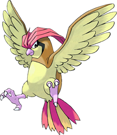
Pidgeotto has always been one of my favorite Pokémon. Its large eyes, hooked beak, and black eye-streaks was always very reminiscent of falcons to me, and heavily resembles a peregrine falcon, or at least a kestral. Actually, the whole Pidgey line is a strange cross between falcon and house sparrow—an odd identity crisis, but they manage to pull it off with aplomb. I'd say skip the sprites and go straight to the Sugimori art. The RB/RG sprites are all pretty weird (though I loved them as a kid), and the Yellow/Pikachu sprites were a bit too stocky-looking for my taste, but Sugimori really nailed the whole line with his original art, which featured in just about every Pokémon publication, seeing as how integral the Pidgey line was to the beginning trainer. There was never a better pic of the beautifully crowned Pidgeot in offical art either. Anyway, with its sleek, predator-like figure, matched with a subdued yet vibrant scarlet and yellow color scheme yet still managing to come across as cute/immature, Pidgeotto was a perfect design for Pidgey's first evolution. Pidgeotto will always be awesome.
I think Pokémon appeal more to me if they've had some kind of significance either in-game, competitively, or in the anime. Pidgeotto is a Pokémon I remember from that Nugget Bridge battle with Gary because of constant Sand-Attacks. It might well have been my first encounter with "hax," either that or that Sing Jigglypuff before Mt. Moon. But really, the entire Pidgey evolution line is pretty bland and unappealing to me. There are better birds, even in first gen—Dodrio and Farfetch'd to name two.
Even in gen 1, where basically everything is simple, Pidgeotto stands out as being really simple. What's it got going for it anyways? Pidgey has the novelty of being the original bird on the first route, and Pidgeot is the bulky looking bird that ends up on a lot of people's final teams, but Pidgeotto is kind of forgotten, and with pretty good reason. There isn't a lot of difference between Pidgeotto and Pidgeot, other than the latter being bigger, in both hair and body. Age hasn't been very kind to our poor bird friend, and honestly it's kind of a disappointing mon all around.
Pidgeotto is another mon I largely overlooked when I was younger; once you'd played through a few times, you knew Rattata and Pidgey were just there to keep you going in the beginning. That said, Pidgeot became a staple in lots of people's teams. Frankly I think that is a real shame; it took Game Freak three games to get Pidgeot to look majestic and intimidating as opposed to just overweight. Until that game, I think players would have been much better off sticking with Pidgeotto. The autumnal colours are pleasing, and the red head crest especially goes a long way to make Pidgeotto a lot more impressive than a mere Pidgey. It also hasn't quite hit the mid-life crisis that results in Pidgeot's weight problem, which is a plus. The downside is that it misses out on Pidgeot's sexy yellow plumage on its head, although it is present in the tail feathers. This is a great design, really, and one I hadn't noticed so much before. The colour scheme is muted but pleasing, and the design is simple enough to suit the typical "first Flying-type," but impressive enough to make you feel like Pidgey was worth picking up. Also, its name is inexplicably excellent!
I am constantly in limbo about which of Pidgeotto and Pidgeot I prefer, and I think my current opinion is that Pidgeot wins out with its superior plumage and overall haughtiness. Then again, I might re-read this article in a few months time (possibly even weeks) and yell at myself for being so stupid. Regardless of that, though, I think Pidgeotto fills its role of mid-stage really quite well. It shows a clear progression from that early-route annoyance, Pidgey, and still has quite a clear jump to Pidgeot (at least in recent sprites). Then again, Pidgeotto—while not boring—isn't exactly the most intricate of designs.
8. Mewtwo
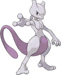
Whoever had the brainwave of the design for Mewtwo should be commended. Like I've said a few times already in this article, I think Game Freak could learn a lot by looking back at their earlier designs: Mewtwo oozes villainy and power without having to be huge and controlling time or whatever. I'll admit that mistakes have been made with its sprites (Yellow springs to mind), but I still love the concept. When you reach the end of Cerulean Cave and you do battle with this creature, you know from the start that you're facing the most powerful Pokémon in the region, and perhaps the world, and Mewtwo carries that off without frivolity.
Honestly, if it weren't for the first or second Pokémon movies I would probably still think of Mewtwo as a hideously deformed alien; its sprites in Red and Blue were that traumatizing. Now, however, I think Mewtwo is universally known amongst Pokémon fans as the original badass. Mew is cutesey, but Mewtwo is that design taken to the park, forced to fight every dog in the neighborhood and then locked in the basement and beaten instead of fed meals. No wonder it looked so deranged all those years ago. On specifics, there are a few things I really like. The tube from Mewtwo's back to the back of its head is a great science fiction touch, and I like its bulbous digits on the hands. I'm also a fan of how bottom heavy the design is—when I think of Mewtwo I think of its large thighs and the over-sized tail. I think so many iterations of Mewtwo as the human-like Pokémon in bad anime scenes has turned me off the design a little—I get a little sick of his feline eyes that may as well belong to any other human in the series and his endless angst. That said, his origin story is really powerful, and I still get chills exploring Cinnabar Mansion. Also, I mean, it's Mewtwo, the original badass. How can you not like the original badass?
Mewtwo is one of those Pokémon that seems to grip ten-year-old boys and not let go, kind of like Charizard does. It's an alright mon—the design is pretty cool, and it certainly achieves the artificial looks its meant to be going for, but what is really so special about it? Not much, honestly. As time has passed, more legends were added that were statistically as strong as it, and eventually it was totally surpassed by Arceus. Strongest Pokémon is a title that just got weaker and weaker with age, which was supposed to be Mewtwo's big selling point. Now it kind of just sits there, like the washed out old champ.
Mewtwo was a great design for the "ultimate boss" Pokémon of RBY. Its design was strange and creepy, but definitively intimidating. While it lacked the obvious brawn and spikes of designs like Rhydon or Gyarados, the sinister air of its thin frame matched with its menacing gaze made it an appropriate face of the ultimate power of Pokémon. I am actually a bit bemused by how later takes on the design made it cuter while more stocky. The almost sickly thin figure and decidedly unnatural looking limbs of the original sprites made it a lot creepier and more intimidating in my opinion. Ah, well, the current look fits better with the franchise so it can't be helped.
Whoa, whoa, whoa, okay. Let's just get one thing straight. Mewtwo has never been totally surpassed by any Pokémon, especially not by Arceus. 130 base Speed and 154 base Special Attack make Mewtwo one of the most potent threats in Ubers, even in BW. He even recently got a new signature move. Mewtwo will forever be the best Pokémon because he can talk, and that puts him on a mighty pedestal. The only Pokémon probably better than Mewtwo is Meowth, because he can talk too but is much cuter and doesn't have pipes growing out of his neck. Mewtwo's Red/Blue sprite is memorable because he looked so alien and out of place compared to the rest of the game world. It's disappointing that Mewtwo's badassery got nerfed, because there was a time when kids in the playground would cower in fear at this angsty mutant freak.
| « Previous Article | Home | Next Article » |