Judge a Pokemon: The Smog's 7th Art Panel
| « Previous Article | Home | Next Article » |
Ohayouu-saaann~~ minna-san, moukarimakka?? (Kansai/Johto dialect: 'Morning folks! How's business??)
Welcome to the 7th edition of Judge a Pokemon. Today, we're airing live from the lively and beautiful region of Johto, home to the best in-game Pokemon story ever. No, but seriously, GS was the the best Pokémon game (except HeartGold / SoulSilver, maybe). It also came with some of the best Pokémon designs, frankly (even if a lot of them are shit competitively). The region of Johto has so many awesome Pokémon; we really struggled to pick out a good list for JAP, but I'm sure it will not disappoint.
Neither will our crew~! Fatecrashers made an early return from retirement, jumping in at the last minute to join us back on our cast. I'd also like to welcome Zracknel to the panel! Zrak is one of the most awesome art contributors to the community, and if you don't know him you should—read more about our special guest panelist in his interview that also features in this issue of The Smog! Special thanks to Birkal for offering to jump in at the last minute, though we managed to get things in gear. I'll be having him join us on the panel some other time.
Oh, also, Bojang pulled rank and jumped in too. Ah, well.
With that, I hope you all enjoy this edition of Judge a Pokémon! —Chou Toshio
1. Tyranitar
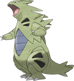

I look back on it with nostalgia, but was it really over a decade ago that I first hiked through Shirogane-Yama (Mt. Silver)? Yes, I was playing on the Japanese version (as everyone in Hawaii did) because the English hadn't come out yet. I remember the excitement of the exploration, well epitomized by the array of fantastic beasts roaming the grasses and cave—the last uncharted territory. What I didn't expect to find though, amongst the great beasts of the wilderness, was one strange cute lizard-cabbage thing that immediately raised an eyebrow. It was so cute and unassuming—rotund and adorable, with a mere level of 20. Still, I was enchanted by the charming treasure I had found, and was bent on capturing it. I remember chucking over 20 PokéBalls at it after paralyzing it, since I had no teammates weak enough to attack a level 20 enemy with (especially since I had no idea what its typing was). Needless to say, I wasn't pleased when I caught it and found it was yet another Rock / Groundd-type...
...until I looked up "Yogirasu's" evolution on Serebii... holy shit... I think the training Larvitar up to Tyranitar was the only thing that kept me playing GS after I'd beaten the Elite Four... It was worth it...
Tyranitar is just such a fucking beast in every way. Even if design-wise, it might just be a Poké-fied Godzilla, it is still one of the most bad ass pieces of work, in battle and design-wise, in the series. Definitely a personal favorite. You guys need to see the 4th movie, where the main antagonist uses a steroid-pumped Tyranitar... "Bangirasu... Hakai shinasai..." (Tyranitar... destroy them please...). It was pretty epic. Uh... be prepared. Probably because of the nostalgia of GS but, almost all my reviews this round will have way too many references to Pokémon movies. Deal with it, or I'll have Tyranitar go firin' its lazor at you.

A fearsome bipedal Pokémon that stands tall. The spikes that coat its back, its serpentine tail, sharp teeth and claws all send a clear signal: this is a predator. This guy is going to ruin you. So, uh, here's a question. Which Pokémon fits this description? Tyranitar?
Or was I talking about Nidoking, Rhydon, or Feraligatr? Yeah, hmm...
Anyone who has poked their head into a CAP art submission thread is no stranger to the following critique, or at least the spirit of it: "this doesn't look like a Pokémon". This criticism is so ubiquitous that it's no longer allowed in those threads. I think we'd all like to see each of the characters of the Pokémon franchise being brilliantly unique creations, each 'mon adding something different to the mosaic of "what it means to be a Pokémon". But let's be real here: as evidenced above, Tyranitar is nothing new. He's a remix of several ideas that came before. He's got so much in common with those other RBY/GSC Pokés that I think it's fair to say that he... looks like a Pokémon. Sure, he's got a color scheme that is mostly unique. No other Pokémon has those black geometric shapes on its chest and limbs. There are some other unique—though minor—features, sure. On the whole, though, I don't feel you can argue that big boss TTar is doing anything beyond the realm of our expectations.
I'm not sold.
P.S. Don't kill me, Chou... ;_;)

I have to say, considering Larvitar and Pupitar who came before him, I had high hopes that what emerged from Pupitar's rocky cocoon would be something bold and exciting, but what we got instead was a stone dinousaur thing with the typical spikes as well as hideously stubby arms. That said, the color scheme is not bad and matches up well its predecessor Larvitar, so nice job on that, I guess. But, man, Game Freak, there were endless possibilities there and you probably picked the least imaginative option possible, what a pity. Tyranitar does look very cute as the mascot for the SPL team Tyrants though, so cute that I did not recognise it as Tyranitar at first, so I guess it has that going for it.

I know this is becoming a bit of a habit for me to say, but Tyranitar is a Pokémon about which I often change my mind. Some of the time, it's grand and imposing; the green hue of its skin is a lovely choice; its gaping jaw the apex of intimidation. Other times, including right now, Tyranitar is a train-wreck of a design. It's fat and cumbersome; the blue seems completely out of place with the rest of it; its head is far too small for its body. It's safe to say that Tyranitar will never be one of my favourite designs, but I suppose (for now, at least) it's safe from any meteors I have at my disposal.

Tyranitar is pretty special for me. I used to hate it right up until the end of ADV. It still has its days when I think it's a clunky-looking, rather plain waste of a good concept. And since choosing to use it as the mascot for the re-hashing of my SPL franchise, I've had to listen to a couple of rather mean comments about how our logo looks more like a Bulbasaur. But there's a reason I was stuck on Tyranitar as a mascot: it's a Pokémon icon. The poster boy for the golden age of Pokémon. There was something different about it—alien, but still familar. Simple, but compelling. Another reason I love Tyranitar is because it manages to do something that none of the prehistoric Pokémon manage to do, other than arguably Aerodactyl—it looks like a threat. It looks like it could, and probably would, rip you in half, toss you up in the air, and swallow you in one gulp. Tyranitar, like Gyarados from the generation before it, is a true monster. It's one of those Pokémon that you needed in order to survive as a Pokémon player in the playground. A powerhouse.
2. Unown


Unown is quite possibly the most ingenious Pokémon to ever come out of the GameFreak hivemind. Unown is much more than just a Pokémon... it is a commentary on man itself. Only a few Pokémon, such as Mewtwo and Meowth, have had the ability to speak or communicate in English, and each is representative of a certain attribute of humankind; Mewtwo is man's lust for power, and Meowth is man's greed and propensity to make terrible jokes. However, Unown... it is much more. With its svelte black and white coloring and single, beady eye, Unown is man itself. You see, one Unown is weak as balls, just like man himself, or at least most people on this website; however, as a group, man is powerful, creating civilizations. I would submit to you that if I could use a team of 7 billion Unown, they would put up a pretty fair fight versus your Ubers team. We must treasure these simple creatures, since they are us at our very core...
ALSO, DID YOU KNOW THAT YOU CAN MAKE WORDS OUT OF THEM? THAT'S PRETTY COOL!!!!!!!!
Unown, a Pokémon after my own heart. Conceptually based on typography and featuring a singular, simplistic, non-expressive eye, Unown seems like it was created to make me happy. It also strikes a chord with me personally because I still feel like a relatively Unown user.
(I'm just going to... leave this high five hanging here in the air... waiting for you... Alch...)
I know I'm in the minority with my opinion, though. Haters gonna hate. Unown was really the first Pokémon to have literally no redeeming value in combat. As well, Unown's simplistic design and lack of visual personality are sure to draw ire from all sides. Their visual identity is a puzzle that's meant to be solved. As someone who enjoyed solving that puzzle back in the GSC days, Unown has my heart no matter what other people say. If you hate Unown's design, please think long and hard before saying so, because I am not sure we can be friends if you do...
~~so mystery~~
So, to be absolutely fair to Game Freak, I'm going to critique each of the 28 designs in turn...
Nah, I'm kidding. Still, Unown is one of the most varying forms of Pokémon around, though it curiously continues to remain bland in every fashion in almost every form. The letter-based forms certainly hold no spell over me, but I have to admit that the other two Unown certainly make me both question my opinions on the Pokémon and exclaim in joy! The reason for the change? It's the sardonic eye. In a design as simple as Unown's—for crying out loud, it's a floating squiggle with an eye—every detail is important. By doing something as small as only having half an eye, the entire personality of the Pokémon changes.
Overall, though, Unown is very much 'A B see (you later)'.
When you consider Unown's concept of some mysterious living glyphs that cover the walls of ancient ruins, you've gotta say that Game Freak really hit the nail on the head on this one. I remember being excited the first time I ran across them in Gold, as they were literally the oddest looking Pokémon I have encountered up until that point. Most other Pokémon have their design roots based in nature or some recognisable object, but with Unown, it does take a couple of run-ins before you realise that these things are alphabets. My disappointment upon discovering their uselessness notwithstanding, Unown is definitely a prime example of the idea that 'less is more'. Their curvy lines and weird stares representing something oh so familiar, but you just can't quite put your finger on it. Very simple, very elegant.
I never really understood what was the point of these until... I saw Pocket Monsters: Emperor of the Crystal Tower, Entei. That, was one of the most awesome anime movies I've ever seen, discounting Ghibli Studio works. Basically, Unown are incredible legendary Pokémon found in everything and everywhere, whose existence transcends space and time, and whose amassed psychic power in a swarm can pretty much do... anything. Like seriously, they can instantly create Pokémon, people, places, bend time and just fuck with reality any way they want. Oddly enough, Unown might be the Pokémon whose power has the greatest gap between in-anime and in-game. They're just so cool, like the sleeping embodiment of the power that exists between gods and nature, with lots of hidden power (lol). This is demonstrated when we see them freely moving about (and dwelling in) the chasm of alternative space-time inhabited by Dialga and Palkia. I tend to think of them as the Pokémon embodiment of Shinto gods/nature spirits, even if their design is a cross between hieroglyphs and western letters. They're just really cool Pokémon, and I wish they'd had a bigger part to play in the plot of the Gold / Silver Pokémon games, instead of just having a weird temple that had almost nothing to do with the in-game adventure. So much lost potential for story telling there. Too bad.
Unown is a Pokémon that I can't fairly critique because I wasted so much time on them as a child that I now just think of them as exactly that: a massive waste of time and potential. I'm sure I'm not the only person who spent hours wandering around the Ruins of Alph trying to piece together the mysteries of Unown only to get absolutely nowhere. I explored every inch of the ruins, tried to decipher the writing on the walls, even took specific Pokémon with me to try and get some response from the game world, but nothing. The Ruins of Alph could have been a fantastic side quest in the games but it was squandered for some reason, possibly just laziness on account of the designers. The only good thing I do remember coming from my hours of wasted exploration is that I found a wonderful little creature called Smeargle in a small patch of grass hidden away.
One positive memory I do have of Unown is those ball capsule things from Diamond and Pearl. You know where you could put those stickers on your pokeballs and spell out messages in Unown when you sent out your Pokémon? Those were great for a while, and I had a lot of fun spelling out some choice words for my opponents in VGC '09. However, those were eventually replaced by the infinitely more rewarding Trainer Card messages: "I want you to see my GUNK SHOT!". Ah, fun with words...
3. Suicune

Soo Soon. Swee Coon... Sooey Seen? Swee Soon?! To this day I am still not sure how to correctly pronounce Suicune. I mean, I've been told the correct pronunciation countless times, I know WHAT it is, but in the back of my mind I can still think of about three different ways I would rather pronounce it, and every time Suicune comes up in conversation at events I'm presented with another alternate way of pronouncing it.
I think from a design perspective, the legendary beasts do the best to represent their respective elements. Suicune, whether wind or water, is graceful, fluid, and elegant. It looks a lot more slender in its official artwork than I remember it in the games. Just looking at it now, it's hard to believe that it boasts such frustrating defensive stats.
I have to say, I did not care for Suicune's design when I first saw it. The overall beast thing is alright...but what's with the total mess on top? It looks like it's trying to delicately balance a surfboard on its forehead, while its body is draped in a loose purple toga and some haphazard ribbons. Looking at it now I'm still pretty ambivalent, but it has grown on me over the years. The original GSC sprites were undeniably a bit of a mess, but Suicune's graceful look has improved with each passing generation. The messiness here combine to create something that's much more than the sum of its parts, and somehow manages to incorporate the idea of the beautiful impermanence of water. Though I can see how someone could be a fan, I ultimately can't bring myself to approve.
Come close, my child, that I may tell you of a legend. You are now old enough to hear.
Long ago, children across our lands wandered the tall grass in search of Pokémon. With aid of the stars' alignment, each child made an encounter with the deity of the north wind. This creature was said to possess the grace of a hundred swans, a cry that brought tears to the eyes, and a GSC sprite that resembled barf.
This, my son, was Suicune.
I have told you stories of many other mythical beasts from the red era and the blue era, but those creatures were different. Many that came before Suicune and its brethren held forms more closely resembling animals. Those that came before also appeared to have fewer details; some say they were more simplistic. Suicune instead is burdened with many features, some of which do not appear to make sense out of an animated context. From the pictures you have seen, can you tell that its twin tails signify the wind blowing behind it? Can you explain the paradox of how its purple mane protrudes into this wind? Dare you speculate how an embodiment of the wind is not of the Flying type?
Neither can I.
What's that? No, my son. I do not know why we call them dogs. That title, much like the legend of Suicune, has never made sense to me.
Suicune has always been my favourite of the legendary beasts (or whatever you want to call them), though I'm not entirely sure why. Perhaps it's my attraction to that lovely shade of blue, or maybe because it's rather elegant-looking. Still, while Zracknel's points about the paradox of its tail(s) and mane are correct, I think the badassery of this design doesn't need reality to back it up. The tails are, in my opinion, a great addition, as they add more depth to the design. I won't pass judgement on the mane, but I certainly can't imagine Suicune without it.
But why is its eye colour red?
Seriously, can anyone not love Suicune's design? I like all three of Johto's roaming beasts, but Suicune is just so captivating. Its sleek form and flowing mane do justice to its nickname, embodiment of the north wind. Suicune is just so fantastically iconic that it is really no wonder that it was chosen to cover Crystal, and to play a bigger, magical role in the movies and anime. If people drew a lot of similarities between Princess Mononokeand Pocket Monsters: Celebi, an Encounter Surpassing Time, it was because Suicune's presence as a fantastical beast captured the imagination enough to make the comparison.
...though out of all the Suicune/Entei/Raikou monikers, "Legendary Hamsters" is my favorite :3
4. Skarmory
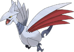
Is it a bird? Is it a plane? Nope, it's pretty much a cross between both of those things—Skarmory! I remember the good old days, of when I was relatively young, wandering about those fields by Fallarbor and coming across this thing. Boy, was I excited to catch this thing. Its beak was pointed superciliously into the air; its crimson wings were spread out intimidatingly. Too bad it sucked. Ah, well, Skarmory is a cool design through-and-through, and a testament to what you can do with only three colours. In my opinion, Skarmory represents everything good about GSC designs, and everything bad about its competitive play.
Then again, I've never played GSC.
While I've always really liked Skarmory's concept and presence in the metagames, one thing that really bothers me is its head. It just looks awful. There's something about the lines, the way that the top half of its head comes down to form its brow and then awkwardly becomes its beak. It's really hard to draw well because it's so badly drawn in the first place, so I've always avoided drawing Skarmory properly even though I'd like to. I think it's also a design that really struggles to look good in three dimensions or from anything but a profile view. The spike protruding from its head looks pretty silly when it's looking at you head on. Sorry, Skarmory, I love the idea, but I think it was pretty poorly executed.
Skarmory was among the inaugural batch of Steel-types to the Pokémon universe, and, as such, was a big part in shaping expectations of the Steel type as a whole. The "armored" look created by its neck plates aid the suggestion that it's no slouch on defense. The razor head-fin evokes imagery of a fighter plane. Those slanted, diamond-shaped eyes give it an attitude of aggression and a predatory status. These features, as well as those of the other metallic GSC 'mons, give us a first impression that Steel-types aren't cuddly. They aren't cute. They have knives for wings. They are here to kill you.
No jokes, Skarmory is cool. Plus, is that a bottle opener for a tail? Awesome.
Make no mistake, I'd enjoy Skarmory much more if it weren't on literally every other team out there, standing in the way between my physical sweeper and total victory. Its body, wings, and tail are definitely pretty cool, and is one of the few times where large spikes look appropriate on a Pokémon. That said, there is just something off-putting about the face. A spiky beak and crown is all well and good, but what's the deal with its eyes and mouth? I have never seen eyes designed like that anywhere else, world of Pokémon or not, and there's a good reason for that —it's damned ugly. Skarmory's upper jaw is also connected to its crown, which also forms the top part of the eye for some unknown reason. It just doesn't work. Also, its lower jaw is also in an utterly awkward shape, plus it has teeth too, which makes the whole mouth part look further out of place. A classic example of a butterface, that's Skarmory.
Skarmory is one of those Pokémon that, despite being really good competitively and having an awesome design, has base stats that don't reflect on said design at all (another being Suicune, who has no Speed despite running like the wind... I don't get it). Skarmory on the other hand, is a bird of prey covered by blades... can someone tell me why this thing has only 80 base Attack and no offensive moves worth using besides Brave Bird? I will never understand why Skarmory wasn't built as an face-mashing offensive tank instead of a full-on wall. Whatever, no matter how you look at it, Skarmory is completely bad ass, fantastic design. (Still needs an alternative form with 110 ATK / 110 DEF, Rock Head, High Jump Kick and U-Turn. Just Saying.)
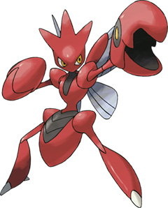
5. Scizor
I'm just going to tap into my powers of prediction for a second.
"Man, Scizor is awesome!!!!!!"
This is just what I am envisioning. This, five times.
Let's face it. Scizor was made solely to appease teenage boys with its Gundam-meets-Capcom-insectoid appearance, inexplicable red/black paint job, dual predatory claws, and sleek metallic wings. Back before Scizor was even marginally relevant on the competitive Pokémon scene, it was still used religiously by its immeasurably large, assuredly frothing fanbase. We get it. everything about Scizor reeks of "cool." The Pokémon-playing universe unanimously agrees.
How is Scizor an evolution of Scyther, again? Why is Heracross not, by that same logic, an evolution of Pinsir? Why does Metal Claw sound like such a badass move but then when it fails to meet expectations you overzealously deplete all of its PP anyway because who wouldn't want to spend their entire afternoon blowing off increasingly relevant responsibilities to imagine Scizor using the most badass metal claw over and over again to strike down its prey?
Man, Scizor is awesome!!!!!!
The part bug, part crab, part robot... thing is a Pokémon that goes up and down in my favourites depending on my general mood. I mean, I want to love it, but it's already so popular and universally loved that I don't think I can truly appreciate it as much as I should. It's like The Beatles.
I think Zracknel has done a good job of listing what makes Scizor a cool Pokémon already, so I won't go over that again, I do have some issues with Scizor though that I'd like to get off my chest.
Why, Scizor, do you have to be so crab-like? Why are you red with big crab claws if you are a Bug-type? Not only are you a crab that's not even a Water-type, but you're better than all of the real crab Pokémon! I happen to like crabs because they look a lot like spiders but I'm not scared of them. I also love Kingler; its one of my favourite Pokémon. And so for Scizor to come along and rip off the crab leaves me feeling pretty disappointed. When I think about how competitively viable Kingler SHOULD be when looking at its design, then for this metal dick to come along out of nowhere with its boosted stab priority and excellent typing... I dunno, man, just all seems a bit sideways to me.
Man, Scizor is awesome!!!!!!
Alright, I only said that to annoy Zracknel, but I do hold a fairly favourable opinion on our Bullet Punching friend. While it doesn't make too much sense for it to have such a bright red colour, it works, and somehow I have to applaud anyone who can make such gaudiness fit onto a Pokémon. My favourite part of the design, however, is the eyes (?) on its claws—it adds so much character to them. In fact, I love its claws in general. It would have been easy to make them very cut-and-dry (no possible pun intended?) but the ridges and features of it make Scizor a pretty interesting design!
Man, Scizor is awesome!!!!!!
That's what I would be saying if Scizor wasn't sadly done in by overexposure. I've had Scizor ruin my day so many times with Bullet Punch that just the sight of its mean red mug makes me annoyed. Objectively speaking though, Scizor is still pretty damn cool. The shape of its head, its sleek body, and its nicely proportioned appendages all serve to make Scizor one of the finest looking Pokémon out there. What deserves special mention, I feel, is Scizor's claws, which have their own face and are just about one of the most awesome concepts ever. There just isn't anything bad I could say about Scizor's design, apart from the fact that its shiny version is an unfortunate shade of horrible highlighter yellow, but hey, every Pokémon's looks has got to have some nitpicky flaw, right?
Uh... I may have fucked up here and picked too many good designs this time around. Like seriously, every one of these is a winner... maybe this is just a testament to the superior creative design of the earlier generations (and maybe this is just a shallow and easily-seen-through attempt to shrug off the responsibility of not having picked a more varied list). But yeah, Scizor, too, is obviously an incredible example of awesome design. I'm running out of superlatives in this issue.
It sure took Scizor forever to reach the top of competitive Pokémon, but design-wise, it's always been just epic. Whether you think Scizor is a ninja, a Gundam, the red Power Ranger, a crab monster... who knows, but from its bladed wings to sleek red carapace, it's just 100% bad ass.
"Man, Scizor is awesome!!!!!!"
I love bandwagoning.
SWEET JESUS, SCIZOR IS AWESOME. I messed it up, didn't I? Sorry, guys.
6. Ledian

Oh good, finally a shitty one. :} If Scizor looks like a Power Ranger, than Ledian looks like a little kid trying to dress up as a Power Ranger. /rate
But seriously, it's funny that one red bug epitomizes the awesome of GSC, and another epitomizes the pathetic of GSC. Ledyba was a such a cute and fun Bug-type that fit well in the fields of Johto... the stupid look of its evo, though, unfortunately turned me off from ever wanting to train one. The only I have to console myself is that Ledian is so much crap competitively, I'd never be bothered to do so.
Man, I must be in a great mood today—this is yet another design that I like! In my opinion, Ledian is one of the few four-armed Pokémon which works well (sorry Machamp!), and I think that's owed to the simplicity of the overall design. There are no complex patterns, which are the hallmarks of B/W designs, and Ledian is certainly no hulking monstrosity. Still, it's pretty epic in its own way—imagining it using Comet Punch is enough to inspire anyone to fight crime!
A cute lil' ladybug takes up the call to be a masked crusader for peace and justice. This is a Cinderella story of wimpy 'mon turned badass superhero. This is Ledian.
Along with counterparts Ariados and Noctowl, Ledian was among a new wave of early game Pokémon that underwent a dramatic personality change upon being evolved. Contrast with predecessors Rattata, Pidgey, Spearow, the fairies Jiggilypuff and Clefairy, and arguably the Nidoran lines, all of whom seem to keep their attitude intact despite evolution.
Ledian is certainly a Pokémon I find interesting, because those awful attacking stats seem completely justified. Where are the natural weapons? I could understand if Ledian were capable of firing lasers or something, but those fists? I have no trouble believing that Ledian, despite its sleekness, is completely impotent.
I like Ledian because it reminds me of Bomberman and I really love the Bomberman series. It's cute too. I think Ledian knows it sucks, but it would just be so happy to be picked for a battle that you couldn't really be angry at it when the other Pokémon holds it at arms length and kicks the shit out of it while it flails all four of its arms helplessly through the air.
Ah, Ledian... it's a shame you're so terrible competitively, because you're a Pokémon I really would enjoy seeing more on the battlefields. While Scizor looks all business, Ledian is a perfect balance of cute and cool. Its little boxing glove-looking arms makes really seem like the little fighter that could, and its larges eyes and bendy antennae just further enhances the adorableness. Its color scheme is a great imitation of its real life counterpart, and is cheerfully bright without being gaudy. Ledian's shiny version is an intense shade of orange, which unfortunately does not mesh too well with its yellow underbelly, but I consider this just a small blip on what is otherwise an excellent design. Sigh... why do the pretty ones always die so fast...?
7. Cyndaquil

Alright, the natural balance of the world has now been restored: I hate Cyndaquil. Well, I suppose I don't hate it as such, but there are definitely points about it which annoy me to no end. Perhaps it stems from its grating voice in the anime. Anyway, if there's one thing I like in a Pokémon, it's its eyes. Yep, you've got it, Sherlock—you don't get to see Cyndaquil's eyes! In fact, I'm not sure if you ever see its eyes. This, combined with its distinct lack of character overall, makes Cyndaquil a really boring design.
OMG... Cyndaquil... it's soooo.... cute... warm when it's sleeping... extravagant... wonderful... here's your bike voucher. But, seriously, I don't know how something with such a weirdly big schnozz turned out so cute. I just got to squeeze it! Fortunately, unlike a real hedgehog, I can go ahead and do that without getting poked. Actually, I can do the same with Shaymin. Someone at GF has a thing for huggable hedgehogs. <3 GF
When I asked Chou Toshio to be a guest on this panel, I did it so that I could comment on the majesty of Unown. However, then I saw that we were also doing Cyndaquil, my favorite Pokémon. I thought about asking Chou again for permission, but then I realized something: I'm an admin, goddamnit, I can give myself permission! So that's where we are now (although Chou stole my stream of consciousness idea...). Anyway, Cyndaquil is the pinnacle of cuteness in Pokémon. It's got those stubby little legs and perpetually smiling face that just makes you squeal with delight. Even that beak of Cyndaquil's just makes me smile. Plus, a fire hedgehog/porcupine is actually a pretty neat design, especially when you consider what Game Freak has been giving us otherwise: dragon (granted, this is pretty awesome), fighting chicken, fighting monkey, fighting pig. Yawn. Cyndaquil is cute and innovative, what's more to love?
Alchemator, you will burn in hell. That is all.
Kudos to Game Freak for making a cute Pokémon without giving it googly eyes, while giving it an abnormally long nose / mouth thing. Its tiny appendages and round belly are obligatory on a basic prevo Pokémon, but what's interesting is that its flames seems to enhance the cuteness, despite their fierce appearances. The blue, red, and yellow colours mesh very well together, and is a textbook example of Pokémon colours done just the way I like it. It would be sort of nice for us to get a peek at Cyndaquil's actual eyes sometime, however...
Cyndaquil and its evolutions are nearly unique—if not entirely unique—in being a Pokémon whose "punchline" of being an echidna with fiery spines hinges entirely upon being seen in an animated context. Before Pokémon Stadium 2's animated models (followed shortly by Crystal's animated sprites) I always thought that Cyndaquil had those flames going continuously. And really, since all of the official art shows Cyndaquil as "all flames all the time", it's not entirely unreasonable to imagine that surely more than one fan's dreams were... shattered... to learn that it was... not the case...
My gripe with all the Gen 2 starters has always been that they don't really gain any distinguishable features when they evolve. They literally become bigger, uglier versions of their pre-evos. I know that's what Pokémon evolution is generally perceived as, but it's far too obvious with these guys. Looking at Meganium and Typhlosion, there's just so much "space" on their designs where something unique could have been added but wasn't. There's far too much solid colour. I think Feraligatr is an exception to this because the Water evo line has a lot of attitude that the other two don't (I've never understood why Typhlosion has such a following). This all contributes to why I don't like Cyndaquil, even if none of it is to do solely with its own design. I just know that it's not going anywhere.
Sorry, Cyndy, I only have eyes for Toto.
8. Celebi

The fabled Onion Knight makes a cameo, this time in the form of a Pokémon. Celebi is everything you could hope for in a fairy Pokémon; with its cute bright eyes and its little wings, it's no wonder that one of its most famous sets is named Tinkerbell. One thing that has bothered me however is the shape of Celebi's arms—they are awkward-looking and just doesn't really fit, and seem more appropriate on an old lady whose arm skins have sagged to the point of no return. But don't let that put you off Celebi, though; everything else about this pixie is quite lovely, even the shiny shocking pink version.
If Suicune made me love Pocket Monsters: Celebi, an Encounter Surpassing Time, then Celebi's design was the one thing about it I hated (oh, and Ash's battle strategy. Seriously, Oak uses Charmeleon against Scizor and Sneasel, while Ash sends out Bayleef—in fact, Ash commands Bayleef to Vine Whip Scizor. PokéBalls might have improved between generations, but battle strategy definitely didn't!). As a character, Celebi did its job perfectly in the story, being the mystical creature with hidden powers that Ash and his comrades had to protect. From its personality, to its time hopping powers, Celebi fit its role in the movie perfectly—exceptfor the fact that I was pulling my hair out at how dumpy it looks. Seriously, make it cute, or elegant—one or the other. I think someone at GF tried for both and failed. I'd have been happier with a green Jirachi, frankly.
Exeggutor is great—the differing expressions of each of the heads lends a lot of character to the design, and the lack of arms—oh, we're talking about the terrible Grass/Psychic-type. Ok. Let me give you a summary of this Pokémon: oh, hello, I'm a green pixie who can distort time, wheeeeeeeeeeeeee!
No, I don't think so. Ultimately, Celebi is just a vastly-inferior follow-up to Mew, who is unquestionably the greatest base-100-everywhere Pokémon ever to be created.
Just another pixie. Looks like an onion. I think Shaymin did everything you'd expect from a cute legendary Grass-type far better than Celebi did simply because it didn't resort to the standard fairy model. I'm really sick of fairies. I could tolerate Mew because it looks like a Moomin, and Azelf because it can explode, but Celebi is one onion I would happily chop to bits without shedding any tears.
I'd like to think I am not a critical person. I see myself as reasonable. I'd like to think that when a situation arises that I deem nonsensical, there is surely a rational explanation to be had somewhere. There has to be a reason that Celebi, the bulbous-headed onion-sprout-pixie-thing, is the time travel Pokémon. This has to be a reference to something. Surely, it's my fault that I don't know what it is. On the other hand, it could be that onions really are the vegetable of the future.
Something about Celebi's longer-than-expected arms have always appealed to me. I've always found their form and shape to be a strange and charming quirk. It's probably my favorite attribute of our time-walking onion overlord.
| « Previous Article | Home | Next Article » |