Smeargle's Studio Update
| « Previous Article | Home | Next Article » |
Introduction
We're back once more, with reviews for three full rounds of the MAC and yet another new artist featurette. Of course, "we" includes myself, princessofmusic, along with my trusted panelists, Blue Frog and Andrew, represented by Altaria, Politoed, and Drapion, respectively. Stick around for a special note at the end of the article as well!
Contests
MAC #30 — Pokémon Makeover
1st Place — brightobject
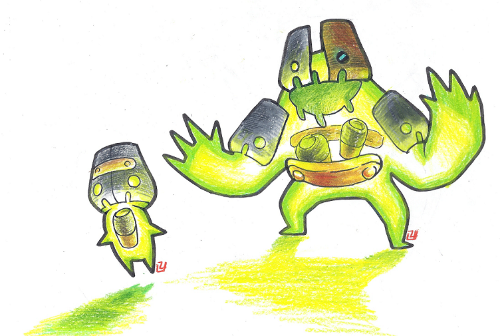
brightobject is an absolutely outstanding artist, and this piece does well in showing some of his numerous strengths. Conceptually, it's brilliant; the artist obviously took many creative liberties in this redesign of two existing Pokémon (I'll leave it to princessofmusic to reveal which ones), but this new design is ingenious, employing the concept of batteries wonderfully. In fact, I think it would have done well as a submission for the CAP 19 art polls as a Poison / Electric type, as it is a great design on its own; I'd have voted for it for sure. Traditional art is generally more difficult to pull off than digital art, yet brightobject does it like a seasoned pro (which he probably is), with clean lines, beautiful colors, and pencil strokes that really convey texture and mass. There really isn't much to criticize here, other than the fact that it kills me this wasn't in CAP, and also that I'm jealous of brightobject's crazy skills as an artist.
These guys look like they could be mobs from MapleStory, at least to me! To clarify, I don't mean that as a bad thing at all, and if anything, it's an indication of good instinct for cartoon design. This MAC asked contestants to redesign a Pokémon or its whole evolutionary line, slightly or drastically, and without a doubt, brightobject (formerly known as hiddenpowerice) opted for the latter, to the point where the designs don't remotely resemble the original ones by Game Freak. The artist shows off a knack for colored pencil, with detailed hatch strokes on the gray and brown metal parts, while the creatures' bright green glow brings it all together. I wouldn't mind if the Pokémon franchise introduced a couple of actual battery-inspired critters. Great technique and concept join forces in this entry to bring brightobject first place. As for the hidden identity of the subjects in this piece, they're supposed to be Beldum and Metagross!
2nd Place — anundeadboy
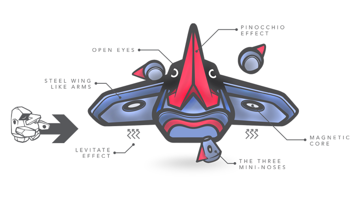
anundeadboy has a well-honed talent for professionalism, represented through both his presentation and artistic ability. Seriously, have you guys seen his art thread? This guy is made for the polished world of graphic design, whether it be on a T-shirt, billboard, or the logo of the next cosmetic product you buy. anundeadboy opted to make this 2nd place entry for the MAC less of a study of artistic aestheticism and more of a feat of engineering. Expertly chosen fonts, immaculate vectors and proportions, and a futuristic expansion on an odd and clunky Pokémon design all contribute to an artwork that is pleasing and intriguing to look at. Do you remember as a kid soaking up every detail of the Pokémon cards for hours at a time, carefully arranging and rearranging them in various orders, and even if you had 10 Weedle and you hated the bug, you never got tired of Sugimori's artwork? I do, and in my humble opinion, anundeadboy's art brings some of that magic to the world, a magic that is highly sought after and so rare to find.
anundeadboy is another one of Smogon's best, and although this piece isn't the best representation of his abilities, it's still a great entry that deserved its place in the poll. I personally don't think that this new design for Probopass is that great conceptually, as it is a bit cluttered in my opinion, but I do think it has been presented in an awesome way, like a scientific diagram. Like all of anundeadboy's works, it has unbelievably clean lines, cleverly utilized text, and fun, vibrant colors, looking insanely professional as a result. Overall, this is a decent concept enhanced greatly by its wonderful presentation.
MAC #31 — Pokémon Cosplay
1st Place — Blue Frog
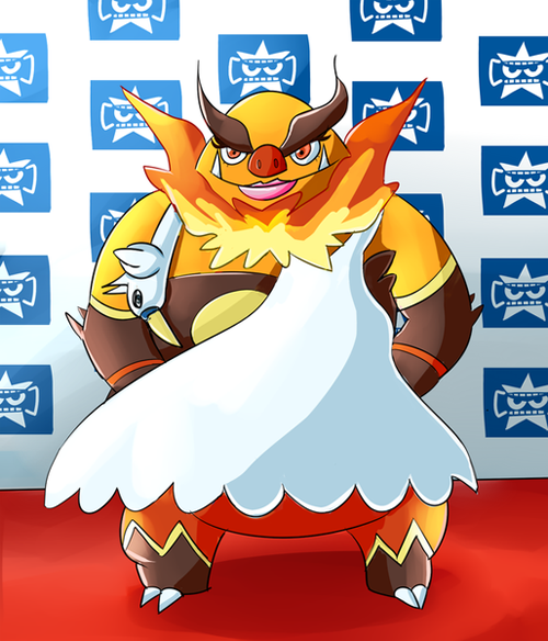
Blue Frog's entries for the MAC seldom come short when it comes to humor, and this is certainly no exception. His idea for this round's theme, inspired by the then-upcoming Cosplay Pikachu in ORAS, was to present the Pokémon world's equivalent of the swan dress that recording artist Bjork wore. Just look at that heavy mascara and those bubblegum-pink lips. The background is certainly a creative treat, in the eyes of someone who completed every PokéStar Studios scenario at least once (yes, I'm that crazy). Artist elements which serve the piece well include bright colors and cel-shading with a twist, featuring subtle shifts in tone even on unshaded sections. Disregarding some slight messiness of the colors and outlines, this isn't bad, Blue Frog.
Blue Frog has rightly earned his place as Most Improved Artist of the 2013 Smog Awards. This piece makes use of humor, clean lines, cel-shading, gradients, and background (which is almost always to be expected from Blue Frog) to clinch 1st place from stiff competition. Emboar as Bjork, the once-espoused silver-tongued Bachelorette from Iceland, makes a stunning entrance on the red carpet sporting a rather eccentric swan dress—props to the Hunter who nabbed it before some other celebrity could properly express the avian garde. All in the name of fashion. Or did Bjork, I mean, Pork, just convince the white turkey to Play Dead? PETA has taken issue, but Pork has stated: "If you complain once more you'll meet an Army of Me". But don't worry, All is Full of Love, especially Pork, and she obviously reimbursed Swan-Kind for its humble service with a reading of their native Pagan Poetry (and a hefty contribution of bird feed). Is this scintillating side of bacon going back to the crib for some Big Time Sensuality? Will Blue Frog win the next MAC? Are bacon, egg, and cheese burritos better than their sausage counterparts? Possibly. Maybe. These, along with other questions (and their answers) await you in the next issue of Smeargle's Studio Update.
2nd Place — TeraVolt
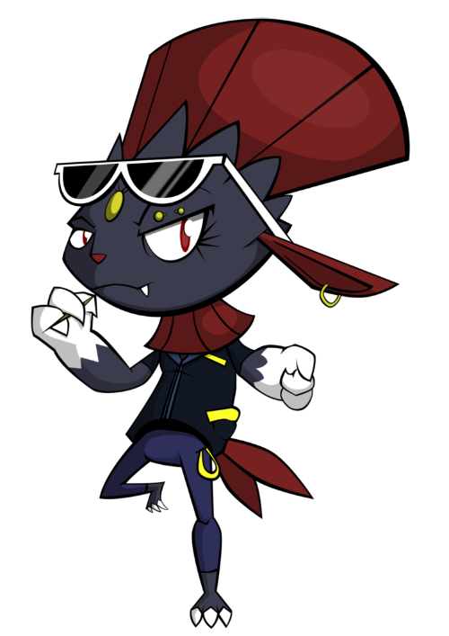
I hate to say this, but I don't think that this piece deserved second place—it deserved to win (what a twist!). Really, I think that this piece is greatly superior to my own technically and even conceptually, and if it wasn't for the inherent ridiculousness in Björk's swan dress, this would have been on top. I think that the outfit for this cosplay Weavile is absolutely brilliant, as it's simple yet extremely effective in conveying the "cool guy" image that TeraVolt was going for, and the sheer amount of personality that TeraVolt was able to put into Weavile with a single pose and expression is incredible. The piece as a whole is insanely clean and professional looking, yet still very interesting to look at thanks to variations in stroke length and cool, cartoonish perspective.
Crisp, vector lines are a staple of user TeraVolt's handiwork, which are the first things I notice visually about this piece, along with smooth cel-shading. The art features a leather-clad Weavile, complete with skinny jeans, shades, and attitude. Variation in thickness of the lineart is a nice quality, particularly along the jaw and red head crest. However, I'd say that the overall cleanliness of the work can easily be a double-edged sword: as someone partial to paintings, vector drawings often don't cater to my fancy, and "plain" is the word I'd use to describe it. That's just a personal opinion, though, and TeraVolt is an ace of this style, earning him second place in this round of the MAC.
Mac #32 — Real World Pokémon
1st Place — naisa chaves
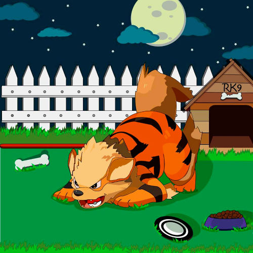
I'll just say this piece looks like it came straight out of a children's coloring book. And that's not a bad thing at all. Many starving artists would give their left nut to illustrate coloring books (not their right one—that's the important one). There are so many things done right in this storybook picturesque setting. Things that stand out to me are the wonderfully thin lines, Arcanine's expression, and the very natural shading, especially the paper cut-out look of the clouds. God I love those clouds. That said, I do feel the fence takes up too much of the limelight due to it's brightness and the relative amount of canvas it occupies. I'm also confused about the direction the drop shadows are cast—the moon is the only light source pictured, and as it is in the background, the shadows should be extending toward the viewer, not away. However, there could be another light source that naisa chaves was taking into account, such as a motion-sensing porch light or a 50 inch TV glimmering through floor length bay windows. These negatives aren't enough to detract from the many positives of this picture however, and like a low risk/high reward 'mon finds itself residing in the S-Ranks. Too bad the same can't be said for Arcanine...
A bunch of random, lesser known artists joined in this time for the MAC, and it was naisa chaves with his/her monumental first post that stole the show. This piece is crazy good, especially for a user who joined seemingly out of the blue. Arcanine is drawn beautifully, with a playful, yet aggressive pose that channels the image of actual dogs very well. The lines are clean, and the colors are vibrant, showing that the artist is very technically proficient as well. I do think that the background seems rather overdone and contrived, complete with all the stereotypical "dog" items and details that are a bit too perfect and geometric (the doghouse, the fence, the grass, etc.), though they don't detract from the piece too much. naisa chaves, if you're reading this, then please come back to Smogon. I, and probably a lot of other people, would love to see more of your art.
2nd Place — Shinxe

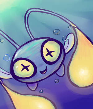
Hawk could one not like this entry? To fit the theme of this MAC, Shinxe, a veteran artist of Smogon and the MAC, chose to portray the art of falconry. This piece features effective composition, great painting technique that simulates the traditional brush, and solid form, both bird and human. Alas, my foremost critique (and what ultimately may have cost Shinxe the win) is that the majority of the artwork seems too blurry, with the sole exception of Talonflame's head, the focal point of the piece. My guess is that the artist's intention was to portray speed and movement; however, the artwork fails to "grip" the viewer in the same way that a sharp painting in full detail would. Alternatively, perhaps this was just a speed paint, a blip in the schedule of a busy artist. Either way, my brava goes to Shinxe for illustrating one of my two favorite Pokémon from Kalos in such a wonderful piece.
I don't like this piece that much for one reason, and I'll have to echo what PoM said—it's because of the blurriness. There's obvious attention to detail, as well as good shading and contrast, but the blurriness detracts too much from the artwork while really adding nothing but an unfinished rough-drafty look. I get the feeling Shinxe just went over 90% of the painting with a blur tool and called it a day. It doesn't help that the part of the picture that is in focus, Talonflame's head, is just kind of ugly. A too-dramatically curving beak paired with a flat forehead and an even flatter expression doesn't scream "look at me!", yet that is what the artist would have us do, and really, I'd rather not. I'd like to admire the cute Eskimo girl and Talonflame's flowing feathers. Sorry Shinxe, I'm a fan of your work, and your tutorials in the Professor Smeargle thread are impressive to say the least, but I'm not a fan of this.
New Artist — faxxifer

Some artists who arrive at Smogon already wield skill and experience. For others, their artistic journeys decidedly start here. In this particular case, faxxifer is an up-and-coming artist who falls somewhere in the middle, and although some aspects of her work could use improvement, she shows plenty of promise as an illustrator. The drawings of faxxifer frequently feature smooth lineart, attractive coloring, and cute ideas, but things to watch out for include keeping proportions consistent and experimenting with composition. In her somewhat short time at Smogon, faxxifer has become a staple contributor to The Player and social media. One could compare faxxifer to an uncut diamond, except that her contributions are already deservedly calling attention, evidenced by her Artist badge, which she received during the making of this issue. Congrats, faxxifer!
Conclusion
As of now, we're officially caught up with reviewing the MAC, which has been postponed for the time being to focus on the super-exciting, annual Smeargle's Studio Secret Santa. Join us over there to witness the unraveling of illustrated gifts, all of which are made by participants and addressed to a totally unknown recipient (at least until the reveal!).
Thankfully, the holiday season is nearly underway, because us writers could really use a vacation. Over the December break, you may find Andrew doodling whilst scouring the forums and ruminating over various OU discussion threads. I guess Blue Frog might also do some doodling, as well as hanging out on PS! (I don't have a clue what either of these guys do). As for myself, alas, I am fettered and bound to the sprite project, which is... where I spent Christmas last year.
From myself and my co-writers, have a lovely winter season and a wonderful New Year!
| « Previous Article | Home | Next Article » |