Ooh, that one's my favorite out of all the ones you posted. Love that shade of blue.

-
Welcome to Smogon! Take a moment to read the Introduction to Smogon for a run-down on everything Smogon, and make sure you take some time to read the global rules.
-
Congrats to the winners of the 2023 Smog Awards!
Worst Pokemon Sprites?
- Thread starter Rankumander
- Start date

CTNC
Doesn't know how to attack
Thought as I was reading in bold. I mainly posted this because of my third thought.

Scyther HGSS is also one of my disliked sprites. What! It looks cool with its battle pose. It just looks so awkward like it's falling over in that stance, Oh, now I see why you hate it. :( and it has the ugliest head out of all the other Scyther sprites. Woah, it looks like an Electrike! If it at least had a different head position it would improve it so many levels. I see your point. It seems a bit forward. (I then tried to think how it position could be changed for awhile and couldn't think of a why that works with the current sprite.) It's even worse with the shiny sprite. Some shinies just look bad.


Confirming this. In GSC, each sprite only has two colours in addition to black and white. Since Shiny colouration swaps out one (or both?) of the colours with another, every instance of that colour in the sprite changes too. I agree re-shinifying* the dirt would be a nice, but weird tough to Diglett/Dugtrio. I mean, how come a Shiny Dugtrio would toss up dirt of another colour than regular Dugtrio do? It would fit perfectly with Diglett/Dugtrio's established logic, though. They burrow through whatever surface they like, leaving no trail but kicking up dirt along the way - no matter what the surface is made of.It's probably because the dirt and the nose have the share colours within the pallete (notice the shading on the body is blue as well)
Would be a nice touch to bring back though
*weirdest word ever?


well, how else would such an otherwise very tall, somewhat bulky Pokemon fit as a minisprite? Most of the larger mons are kind of awkwardly squished/hunched over in the Gen VI minisprites. It's unfortunate, because they attempted to be much bolder and intricate with the designs, but some took a fall like this. :(Was just staring at the OU viability rankings for a bit and

No I'm sorry what the fuck
It's hunched forward so awkwardly. Like just imagine that fully sized
It's just standing normally and then suddenly it's jutting it's neck and arms out
I have to agree with how the coloration of the
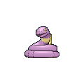
Platinum Quagsire is a real mess. The lovely shade of blue it usually has becomes this odd dark shade which really clashes with the over-saturated red tongue. The arm and feet positions really bother me and just make Quagsire goofy in a very bad way and not the usual adorable goofy charm that it usually has.

Thankfully HGSS fixed these flaws and became one of my favourite Quagsire sprites with a much better, and my favourite blue/cyan. It has the best balance in terms of brightness and is a big improvement, even when comparing it to the DP version below in terms of hue.

Unfortunately, the 3D sprite transitions wasn't kind to Quagsire- it just looks like a big blob since you can't even see the few features that make it a Quagsire- which is the tail and those back fin things. It just looks like a blue blob. Not to mention the blue is really barely there.


The lack of features make the Shiny version look too much like Ditto- except it has limbs.
Scyther HGSS is also one of my disliked sprites. It just looks so awkward like it's falling over in that stance, and it has the ugliest head out of all the other Scyther sprites. If it at least had a different head position it would improve it so many levels. It's even worse with the shiny sprite.


Hopefully, Game Freak will give the models deeper, richer coloration for Gen 7.
Disagree with your opinion of the HG/SS sprites though. He looks like he is in the middle of a series of furious strikes and slashes, perhaps about to finish off an opponent that is down.


Fearow is love, fearow is life, I always loved that one, I always felt GSC nidoqueen where weird as hell.Finally evolve into awesome Metagross

...yay

DJ Mudkipz

I love how he looks scared of his own tail

Because drawing a bird is hard
I remember being freaked out when I saw Fearow in POKEMON stadium. This sprite made me expect it to be small, fat, and round.
Because drawing a bird is hard
Looking back at the 2nd gen, I realised some sprites (especially back sprites) really weirded me out:

I mean, look at that big pile of turd. A poke as cool as Forretress should be represented in a better way.

HELP MEH!!! (If you were wondering who that could be, it's Golem...)

Looks like Dumbo stuck his trunk out of the water to avoid drowning... ugh

-I CAN'T HEAR YOUUUUU!
-Aye aye, captain!
Lastly, I give you dancing mons!


The tall grass can't handle us right now XD.Amateurs
IT'S FUN TO STAY AT THE


O.oAmateurs
IT'S FUN TO STAY AT THE
I can't unsee it.


Sorry, green mew wins that race.Golbat's sprite from Gen 1 is actually the ugliest thing I've ever seen....

Maybe it's a voyeurist.Golbat's sprite from Gen 1 is actually the ugliest thing I've ever seen....

Ever since Bank opened and I did some breeding in XY to finish up my dex, this sprite has plagued my mind.


Never really liked this original Poochyena sprite for some reason. In fact it made me hate Poochyena a lot back in 3rd gen, and I didn't really notice that I liked Poochyena's design until seeing anime/Sugimori art and most recently, ORAS. Maybe because it looks a mix of angry, dopey and generic here? But when I compared the ORAS sprite, I love the details like the big fluffy tail and it's slightly adorable face. Maybe the angle also helps.


Left is Gen 3 and Right is Gen 4. The only noticeable difference besides colours is that little change of position in the hind leg...pretty disappointing. Also for a pokemon known for straight lines the curved sprite really bothers me for some reason, especially when I see the design in the anime and how different the two designs seem.

Thankfully the by Gen 5 they gave it a completely new sprite that gives me a better sense of the design.


A lot of Ekans sprites are really disappointing, mostly because of the odd head anatomies. Granted RBY is one really bad but then most of Gen 1 sprites are bad (Green looks more like some weird rubber duck head). Then GS gives us the really strange bright pink Ekans as the normal colour scheme but at least this is fixed in Crystal.


It annoys me that Ekans has the odd head shape in both DPPt and BW(2). I cringe at the Gen 5 back sprite because of the head although generally Ekans back sprites are much better than front sprites. Even Gen 6 wasn't the best, the head now seems too flat.


HGSS is probably my favourite in terms of anatomy. I really thinkthe Gen 3 and 4 back sprites bring out the best of Ekans at least.
R/B most def. has the most disgusting sprites imho. In Yellow they reworked the sprites of the opposing Pokémon into something amazing, but they unfortunately didn't rework the sprites of allied Pokémon. I'm now going to look up some sprites from R/B/Y I find horrendous.


I probably forgot some. In my opinion almost all the opposing Pokémon sprites from Yellow are super dope, if not the dopest. I like them so much.
I probably forgot some. In my opinion almost all the opposing Pokémon sprites from Yellow are super dope, if not the dopest. I like them so much.

Might I remind you all of the gen 1 dragonite sprites
Attachments
-
 52.8 KB Views: 672
I think Dragonite's back sprite is pretty dope.Might I remind you all of the gen 1 dragonite sprites

It's not that bad, to be honest. It actually looks intimidating. Not like the Gold/Crystal sprite...

Crystal is worse because of that animation.