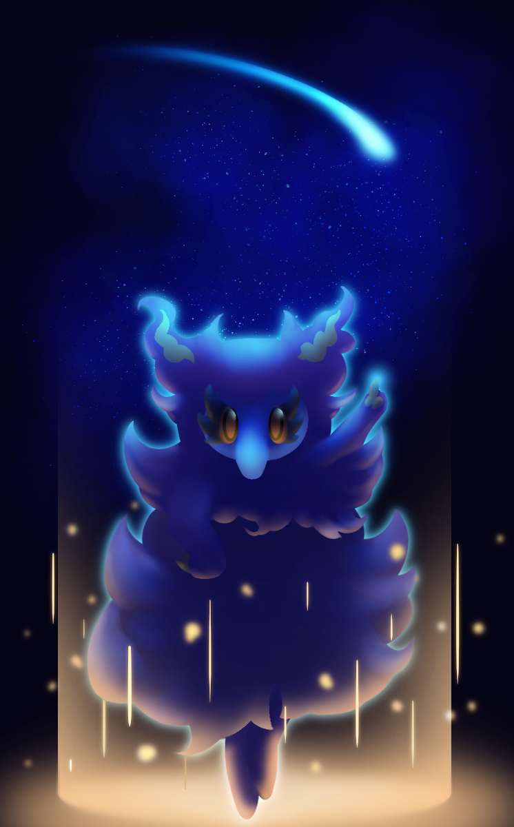
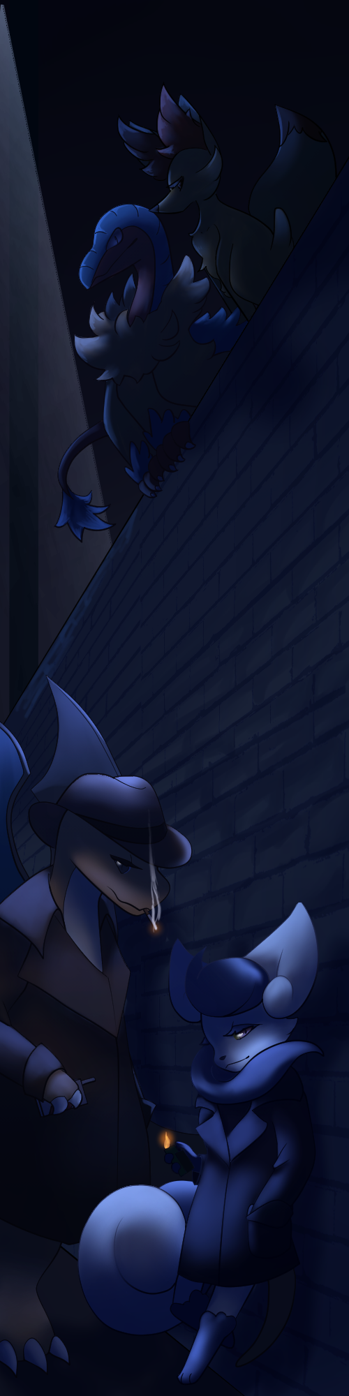
So these were all quickly done, proof-of-concept sketches, since I already had a few ideas on what I wanted to do for this request (the actual request was pretty simple - draw ho-oh, necrozma-dm, or yvetal looking regal iirc - so I had a lot of wiggle room here). I normally just use these sketches for, y'know, proof of concept. To see if an idea I had in my head actually looks decent on paper. Luckily the only one of these sketches that needed tweaking was Yvetal; originally I wanted its pose to be "tighter" but it ended up looking pretty stiff and messy, so I spread out the wings a little and adjusted the head until it seemed less rigid
The actual quality of these sketches doesn't matter at this stage (like the Comic Sans didn't make that obvious lol), it's mostly about seeing which idea appeals to the requester. The Necrozma-DM sketch was struck out first, leaving the other three. So I offered to make shaded sketches. My next step is generally to produce a second, higher quality sketch that'll then be cleaned up and either used as a base for lineart or used as lineart itself. But I ended up producing three fully coloured and shaded sketches instead somehow


So this normally doesn't happen during my process. Mostly because while I'm sketching I have a solid idea of where I want the light source to be, what colour I'll use for the shadows, how much backlighting will be present, etc. But since these drawings were being made to aid with the selection process, I wanted to try and replicate the final product's shading as much as possible. I couldn't just make slightly higher quality, black and white sketches with labels to explain different parts of the piece's lighting. Because that would have been a sensible thing to do, and I am not a sensible woman
So instead I got carried away working on the Yvetal piece and realised that I'd have to keep the same level of quality for the two Ho-Oh sketches. Mostly because I didn't want to subtly try and guide the requester towards a certain choice - even if the Yvetal piece was my personal favourite
In hindsight suggesting to do this was a stupid fucking idea but hey, we all make mistakes sometimes
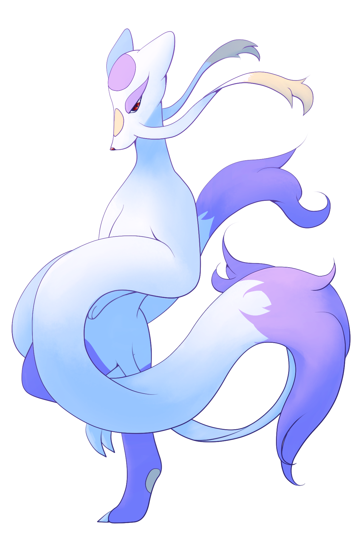
The third and final sketch, with a much higher level of polish. Most notable are the covert feathers; they're not actually present in the final lineart, but rather are implied via shading. . I also adjusted the Ho-Oh's head further, to give the impression it was looking down on the viewer in disdain or some shit. There were also some further anatomy tweaks, like making the head smaller, the tail feathers longer, and making the talons look more like actual talons and not limp, vaguely talon-like entities
This is the finished lineart, with added colour. Lines are generally weighted based on where the shadows will fall in order to imply a light source and will also be heavier at the corner of overlapping lines for emphasis. The lineart part of the process is the one that I find the most annoying, purely because drawing clean lineart is an absolute pain, even if you use vectors like I often do
This is the finished set of shadows; two layers with different blending modes, one multiply layer using a light saturated red and one hard light layer with a darker pink. Normally I don't use blending modes for shading - at least, not this much. But when it comes to shading entities with patterns such as Ho-Oh's neck stripe and white chest, I generally use them so that I don't have to separate each colour into an individual layer. Some pieces can have five or more layers dedicated solely to shading, so this way I can save myself the hassle of having a comically large amount of layers
Now the lighting. Not much to add here that hasn't already been stated in the shadows part. Three layers this time; two again with blending modes - one Add layer with dark rust colour and one Hard Light layer with another light red - and a normal layer for the added lighting on the head and neck. I also added the fire roughly halfway through this part
The astute among you might notice that the piece also looks a lot more pinkish than it did previously. While I was shading I noticed that the green on the feathers kinda looked sickly? So I just slapped a Hue layer on top of the whole thing at, idk, around 50%? and called it a day lol
The final step (asides from text ofc): colouring the lineart. It's a stylistic choice, but its easily my favourite part of the process due to how well it ties the whole piece together. I just eyedrop the darkest available colour on the screen, darken it a little more, then apply liberally. A simple step, but its a nice way to unwind after spending.. idk, 4-5 hours on a piece?
And for those interested, this is the coloured lineart without any, y'know. Colour. Obviously its not perfect, but since it's not supposed to be seen like this its fine for there to be small errors
.. And that was my entire process. Ofc throughout the process I kept going back and correcting parts I thought looked weird - I completely redrew the primary feathers right towards the end of adding the shadows because they looked kinda funky lol - but that's all there is to it really. Even though I ended up burnt out when I was finished, I still enjoyed drawing this piece and challenging myself with the wings and bird anatomy. I actually have a few practice sketches somewhere that I made in preparation, but I'm not sure where they went lol. Either way, I'm very happy with this personally, so I'm looking forward to when the thread goes live x